Mobile-First Design: Why Your Website Must Work on Phones
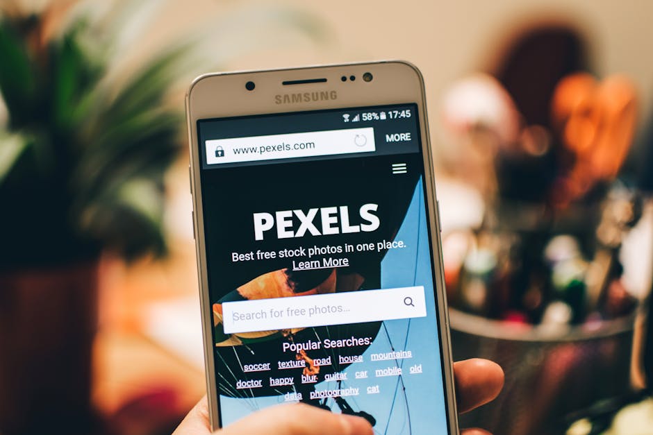
Walk down any high street in the UK and you'll notice people browsing on their phones. This behaviour translates online too. Recent statistics show that more than 60% of web traffic comes from mobile devices, and Google has made mobile-friendliness a key ranking factor in search results. If your website isn't optimised for mobile, you're not just providing a poor user experience—you're also hurting your visibility online.
What Mobile-First Design Means
Mobile-first design means building your website with mobile users in mind from the start, rather than adapting a desktop design for smaller screens. This approach ensures that the most important content and features are prioritised on small screens, and the experience is genuinely good, not just squeezed and awkward.
The Real Impact on Your Business
When someone visits your website on their phone and has to pinch and zoom to read text, or buttons are too small to tap easily, they leave. Studies show that slow mobile sites or poor mobile experiences cause visitors to bounce within seconds. That's a lost opportunity.
Conversely, a smooth mobile experience keeps visitors engaged, increases the likelihood they'll contact you or make a purchase, and improves your search engine rankings. It's a win-win.
Key Elements of Mobile-Friendly Design
- Responsive layouts that adjust to any screen size
- Readable text without zooming required
- Properly sized buttons and touch targets
- Fast loading times on slower connections
- Simplified navigation menus
- Forms that are easy to complete on a phone
Testing Your Current Website
You can easily test how your website performs on mobile by visiting Google's Mobile-Friendly Test tool, or simply opening your site on your own smartphone. Does it look good? Can you navigate easily? Is text readable? If not, it's time to consider a redesign.
Mobile-first design isn't a luxury or a trend—it's a necessity. Your customers are on their phones, and your website needs to meet them there with an excellent experience.